Sunday, 12 April 2015

Evaluation - 7 - Improvements


You can see I have massively improved on all aspects of creating a magazine front cover. 


As these are my final products I believe I have improved massively. If you were to look back at early posts on my blog it is clear to see that I have improved my Photoshop skill, although they could still be improved a lot more. 
Before making my final product I made some mock ups to get some final practice at photoshop. 


I practiced basic photoshop skills on these two mock ups.


I have also improved in understanding terminology of media conventions. This is shown in these two pieces of analysis.


I also learned that the more you use the new technologies, you will get used to them and this will allow you to improve at using these new types of technologies such as photoshop.


If I were to do this again I would edit the images, as when I first took the photos I didn't have the knowledge about lighting and how to increase the quality of the photo. The reason I would do this is because then shadows won't appear on the photo. The preliminary task was very helpful as it helped me gain a little understanding of the level of ability I was at when using tools such as photoshop. After completing the preliminary task it was clear I had very little skill and understanding of making a magazine. However it is clear that I have improved compared to the preliminary task and my front page, contents page and double page spread.





Friday, 27 March 2015

Evaluation - 6 - Technology


I used a number of different technologies to create my magazine and I had to use different technologies in the process of making my magazine. 
The technologies I used are:
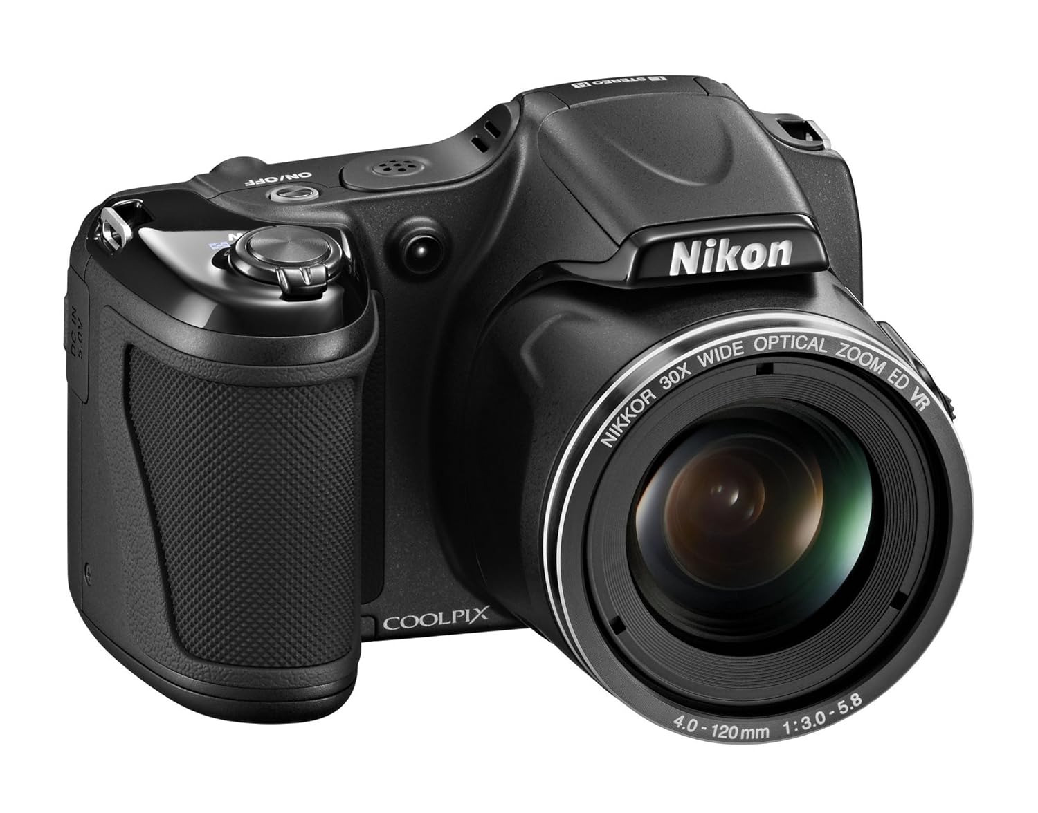
A camera,  Nikon Coolpix L82 was used to take photo's of the models for the magazine.
I used this camera to take the photo's of themodels for my magazine. I did this because it is a high quality camera. I was able to take high quality photo's that are of high quality. 


I also used Prezi to create a presentation to show the conventions of my magazine. Prezi is cloud-based, meaning you can present from your browser, desktop, iPad, iPhone, or Android device and always have the latest version of your work at your fingertips. Create or edit on the go, then auto-sync across all your devices with ease - prezi.com


The reason I used this prize is because it is an easy way and to combine pictures and images into an easily usable slideshow/presentation which allows me to show information about the conventions of my magazine through this slideshow.

To edit my magazine I used Photoshop to create my magazine and I also used blogger to post all of my planning on as well as my final product. I found it very easy to post on blogger regularly as you can go into much more detail about what you did by just generally explaining it. It’s very straightforward. I think that since the preliminary task of creating the college magazine I have definitely improved my skills and knowledge to create a successful magazine. However, during the preliminary task we didn't have to do the double page spread, so for the music magazine it was the first time creating one, but I made sure to do several drafts to improve.

I also used YouTube to post my audience response video, this then allowed me to embed this video onto a post on my blog.The reason for using this piece of technology is that it is an easy way to put a video into my work. By using a video it's a different way of giving information and feedback rather than it been all text.


Blogger allows you to post blogs on anything you want allowing you to present them to viewers of your blog. I am using blogger to post my research and my final product of my music magazine. This is an easy way to present my work as it allows videos and pictures onto my blog. Blogger also allows 'Prezi'. So I can put the slide show I made on Prezi onto my blog by embedding the link. 


A Prezi of technologies I have used. 
 

Thursday, 26 March 2015

Evaluation - 5 - addressing the audience

How did you attract/address your audience? 

I did this in a number of ways. One way in which I did this is by using a plug.


By using a plug this will grab the audiences attention. The whole reason of using a plug is to entice the audience into giving them the chance to win free items, for example they can win free concert tickets or a free holiday etc.
By including the plug it will give the audience a chance to win something in return if they chose to enter the competition. The plug I used to win 'K.O' tickets is used because 'K.O' is the main artists in this issue of the magazine. 
The use of a plug targets a niche audience as it targets a specific audience and their interests. I used the plug 'Win free K.O.' tickets. This targets K.O fans as they have the chance to win the tickets, allowing a wider audience to buy this specific issue of the magazine due to the chance to win tickets. This gives a positive impact on the buyer and will encourage them to buy more issues of magazine.
The audience was students meaning that they won't all have a lot of money to spend on concert tickets and also the subscription fee might still be too expensive. Therefore I gave the students the chance to win the free concert tickets as well as only paying £2.50 for the magazine. This is an easily affordable price to the average student, this allows me to keep on targeting a specific audience which is the students.


By using a list of artists featured inside of the magazine it will attract the audiences of these artists used in this list of artists. 
By using these artists this will allow their fans to buy the magazine as they will want to read more about the artists that are listed. This gives my magazine a specific audience of students who listen to Rap/Hip-Hop as this is what music genre these artists fall into which therefore is the genre of my magazine as this is why they are featured on it. 
Fans of these artists will now be willing to buy the magazine to read an article on them. Also new customers of the magazine may still read up on these artists and then may end up liking them and will encourage the new customers to carry on buying the magazine as they may think that artists they don't yet know but might like will be in future issues of the magazine.


Also by using an artists with a quote featured in the story this then gives the audience an insight on what the story is about. This is meant to entice the audience into buying the magazine to read the article on this specific artists. Kid Ink is an American Hip-Hope artist. This also gives my magazine a specific audience which is Hip-Hop artist. Fans of Kid Ink will want to read the article as it is on an artist they like. Also people who buy the magazine might not know who Kid Ink is, This will then give the customers a new reason to carry on buying issues of the magazine as artists they like will be in the magazine even though they might not who they are yet. This will also encourage the wide spread of an audience as people may want to find and listen to an artist they don't already know.
Then if the reader then goes on to like this artists they could tell more people about this artists and the magazine they found the artist in, which is my magazine 'Sounds'. This will then increase the general number of audience. 

Evaluation - 4 - Target Audience

Audience research is important because...
It allows you to design the magazine to the target audiences general taste which in turn, increases sales.
It gives you a better understanding on what stories to include and who to base them on.
Questions I need to ask

How much you willing to pay (ask this to 5 people)
What artists would you like to see in the magazine
What kind of stories would interest you
What kind of colours would attract you
What kind of clothes would you expect to see from the models
How frequently would you like the magazine to be published (daily, weekly monthly)
Paper copy or electronic copy and why
What props do you associate with the genre
What do you want to see more in music magazines (mise-en-scene)


Target Audience response 
What artists would you like to see in the magazine?
The audience responded with very similar answers which included artists such as: Kanye West, Kendrick Lamar, Kid Ink and chance the rapper 
What kind of stories would interest you?
The audience would like to see stories about the artists childhood, before they were famous and also what it's like going up on stage in front of thousands of fans. The audience would also like to know what motivates the artists to carry on with their career in music. 
What kind of clothes would you expect to see from the models?
When asked this question the audience responded with the same answers, in the magazine they would expect the males to wear baggy clothes and for women they would expect them to wear tight clothes.
How frequently would you like the magazine to be published? 
The audience answered with a number of different answers, some said daily, some said weekly and some also said monthly
Paper copy or electronic copy and why?
An even number of answers were given to this question, some would like an electronic copy because then the magazine can't be damaged as it will be seen on a tablet or computer etc. However people would prefer it as a paper copy as they would like to hold the magazine and be able to take it anywhere they would like.

This shows that the audience would like similar things in the magazine, for example they said they would like to see artists such as 'Kid Ink' in the magazine, therefore to please my initial target audience of teenagers I added the desired artists they wanted to see into my magazine.
The reason I targeted teenagers is because they have a lot of leisure time after college. In this time they could purchase my magazine and read it, if the first buyer has finished reading the magazine and they leave it around the house due to students mostly living with other people then another person in the house could pick up the magazine and then read it. This will widen up the audience and also increase purchase numbers because if they like it they would possibly subscribe to magazine.
Also the audience said they would expect baggy clothes for the males, this is shown as on the front cover the model is wearing an open button shirt, this also supports the stereotypical view on this specific genre.


Wednesday, 25 March 2015

Evaluation - 3 - Institution

The media institution is who publishes the magazine and who gets the magazine to the audience. I have decided I want my music magazine to be published through the Bauer Media Group mainstream institution because I think it will make the magazine become increasingly popular and attract an audience that will hopefully want to buy the magazine regularly. Also the reason I would like this to happen is because Bauer Media don't have a magazine similar to my genre, therefore this will open up a wider audience to Bauer Media as fans of my music magazine genre specifically will mean that they may then look at other Bauer Media products giving them a wider audience as well as my magazine becoming increasingly popular due to the mass audience of Bauer Media as it is already a hugely popular institution. Also due to Bauer Media not having a similar genre that they publish will mean that there will be no competition with other magazines as my magazine will be the only one of it's type. This will allow a mass amount of audience have no other option to buying another magazine of my genre belonging to Bauer Media. A magazine that is similar to mine is Vibe magazine. Vibe magazine also features Hip-Hop and R&B artists. Vibe magazine is published by SpinMedia.
Also to progress on the distribution of my magazine I would make an online version supported by the website of Bauer Media for example, this would allow people to have an electronic copy. This would allow the audience to view the magazine without them having to carry a physical copy with them.   

Evaluation - 2 - Audience


When I created my magazine I was mainly targeting students as a main audience. I did this because students listen to music nearly everyday and also if a student has just finished a day at college they would like to relax. A way to do this is to listen to music and often some students would read  magazine. This way my magazine would be a good target to students. Students often live with other people, whether it be their parents or guardians or maybe a house/flat with their friends. If the initial buyer of the magazine has finished the magazine then they will leave it around the house, perhaps another member of the house will pick up the magazine and will spread the audience numbers and viewers of the magazine.
To grab their attention i tried to ensure that my music magazine would stand out and grab their attention, specifically students. I did this by including the names of big artists belonging to the genre of my music.
On the contents page I included social media such as twitter and Facebook which appeals to the audience of students who use social media.
On the double page spread I used a quote made by the feature artist which was also used on the front cover, this would lead them to the story as this quote would lead them onto the full story. 

 Demographics are set out into a table for target audience which represent social class. There are six groups for the target audience. They are named group A, group B, group C1, group C2,group D and group E. 
In group A the target audience is towards your upper class people, such as Higher management in business, bankers, lawyers, doctors and other professionals that are in a high class.
Group B: is Middle management, this includes workers suck as teachers, creative and media people such as graphic designers.
Group C1: is Office supervisors, junior managers, nurses and specialist clerical staff. This is known as white collar.
Group C2: is skilled manual workers, this includes plumbers and builders. This is known as blue collar. 
Group D: is Semi-skilled and unskilled manual workers, more of working class citizens.
Group E: is unemployed people, which includes students, pensioners casual workers.


Main Story -  I chose the stereotypical audience which is a young black male. He is dressed in all black to show that he is prestigious and the green background also shows that he has a wealthy standard of living as green generally denotes wealth. I did this as this as Hip-Hop music generally express the love for money and prestigious lifestyle.

Plug - The use of a plug targets a niche audience as it targets a specific audience and their interests. I used the plug 'Win free K.O.' tickets. This targets K.O fans as they have the chance to win the tickets, allowing a wider audience to buy this specific issue of the magazine due to the chance to win tickets. This gives a positive impact on the buyer and will encourage them to buy more issues of magazine.


Evaluation - 1 - Conventions

In what ways does your media product use, develop or challenge forms and conventions of real media?

This is an existing magazine front cover from Vibe magazine. I have shown it's conventions and used L.I.I.A.R analysis.

I have used similar conventions on my music magazine.

By using conventions such as Masthead it is clear to see the title of the magazine allowing the audience to see the title of the magazine clearly. Also by using the featured artists then the audience can see who is featuring in the magazine, if they are a fan of any of those artists then they will be encouraged to buy the magazine.


First of all to be consistent I needed a house style from the planning and research, I decided to use the three colours of: green, black and white throughout my media products which I created. I chose these colours due to me mainly seeing the colours black and white used on a number of magazine covers such as XXL and Vibe. These two colours, black and white, contrast each other as they are complete opposites, I also decided to choose these two colours as this shows the contrast in types of Hip-Hop music as there is many ways in which artists present their music. First of all white is a colour which is considered to be the colour of perfection. Some people will say that Hip-Hop if the perfect music genre, hence the reason I used white (the colour of perfection). Although black is the complete opposite to white in general music terms, black connotes the power of the genre as Hip-Hop has a huge population of listeners. Black also denotes a prestigious colour, for example a black tie event, black Mercedes.  I added green to these colours because the dark green, which I used, represents money and wealth. I did this as many Hip-Hop artists express their love for money and their affluent lifestyle.

Also on the front cover I used the image of the artist which the main story is about, this gives the reader the impression that this specific artist is the main feature in this edition of the magazine. I also represented this by placing the artists name in the centre of the magazine to show who the story is about.

Friday, 19 December 2014

Front Cover of Music Magazine


This is the front cover of my music magazine. The music magazine I am doing is rap. This photo shows the stereotype for rap/hip-hop music which is generally a young black male who shows violence. This image shows these stereotypes due to there been a gun and sunglasses which is seen as violent. The male used for the image is opening his shirt and showing off the gun, giving the impression he is violent and isn't afraid to use the gun. This is stereotypical of rap artists and rap fans.

I have put the masthead big and clear at the top of the page so that the audience can easily see the name of the magazine.
The image is centred on the cover of the magazine making it clear and it spreads over most of the page.
I have put a number of story title's on either side of the magazine cover meaning that the reader can see what the magazine has inside just by looking at the front cover making the reader aware of what's inside this issue of  the magazine.
I have also put the price of £2.00 in the corner to show how much the magazine is.

Monday, 15 December 2014

mock up of Contents page

1.
2.
3.

These are ideas of how I could layout my contents page. By putting The 'Story Title, Introduction and page number' together it means that the reader will be able to read a little bit about the story to get them interested and then they will see the page number of what the full story is on. The image related to the story is to give the reader that slight bit of entertainment and to give them a bit of recognition towards the story.
I am most likely going to use a layout like number 3 for my contents page as the image dominates the page meaning that I could include one main image of the artist involved in the main story which gives the impression that the magazine is focused on that specific artist. Whereas 1&2 are balanced out between image and text which means that there will be too much text on the page. The context page should just include an image, story title with the page number of the story and a brief introduction to each of the main stories. 

Thursday, 11 December 2014

Front Cover Image

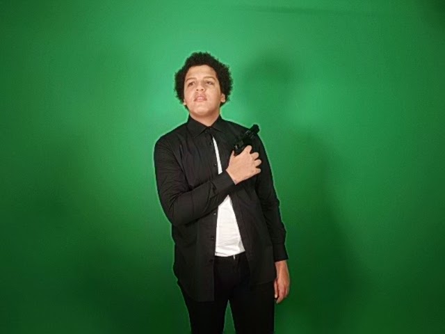
This is going to be the image I am going to use as the front cover of my music magazine. The music magazine I am doing is rap. This photo shows the stereotype for rap/hip-hop music which is generally a young black male who shows violence. This image shows these stereotypes due to there been a gun and sunglasses which is seen as 'urban' and violent. The male used for the image is opening his shirt and showing off the gun, giving the impression he is violent and isn't afraid to use the gun. This is stereotypical of rap artists and rap fans.

Front cover photo ideas


The problem with this photo is that the lighting is bad as the shadow covers half of the shot and this is a medium shot rather than a close up


This photo could be used as the lighting is good, however there is a slight shadow to the left of the shot. 


The problem with this photo is that it is a medium shot and the model is not facing the camera  


This photo is a bad photo for the front cover because it is a long shot as you can see the full body of the model used.


The problem with this image is that the shot is a medium shot and not a close up. Also the lighting is bad as you can see a number of shadows that are easily noticeable.

This photo has bad lighting and it also is not a close up, therefore showing the top of the models legs. Also the model isn't looking down the camera.


This photo is a good photo as the shot is a close up and the model is looking down the camera. However there is a shadow in the background which is fairly noticeable. 


This photo is a bad photo because the lighting is bad as there is a shadow on the right side of the shot and the model isn't looking down the camera.


This photo is a bad photo because the lighting is bad as there is a shadow on the both sides of the shot and the model isn't looking down the camera.


Despite there been a shadow on the sides of the shot, this is a good image as it is a close up and the model is looking down the camera. Also the shot is in focus on the model, this then made the shot clear and it isn't blurry. 


This shot will not be used as the model is laughing and the lighting is also bad as there is a number of shadows 


The good thing about this shot is that the body language of the model is showing aggression which is stereotypical for rap music. However the lighting is bad as there is a big shadow taking up most of the shot.


This shot has bad lighting and the model isn't looking down the camera.


This shot has bad lighting which then caused a shadow at either side of the shot however the shot is in focus and 


The problem with this image is that the model is looking above the camera and isn't pulling a serious face.


This image has bad lighting, causing the shadow on the right of the shot which is highly noticeable, also the shot is a medium shot, rather than a preferred close up.


This image is a medium shot and has a shadow at either side of the shot, however the stance the model is in is showing aggression through body language. 


Monday, 17 November 2014

Google mock up


These are the mock ups I have made so far. This is my progress on Google mock ups so far.


I changed the mock up so that the text of 'Tyler The Creator' is in the middle of the magazine and has no background so that there isn't a white background covering the top Tyler is wearing. This still needs 'More Inside' adding to it

This is the final Google mock-up of Tyler The Creator, I added 'More Inside' since the last progress screenshot.
This is an example of how I would layout my magazine.


Tuesday, 11 November 2014

Target Audience

Audience research is important because...
It allows you to design the magazine to the target audiences general taste which in turn, increases sales.
It gives you a better understanding on what stories to include and who to base them on.
Questions I need to ask

How much you willing to pay (ask this to 5 people)
What artists would you like to see in the magazine
What kind of stories would interest you
What kind of colours would attract you
What kind of clothes would you expect to see from the models
How frequently would you like the magazine to be published (daily, weekly monthly)
Paper copy or electronic copy and why
What props do you associate with the genre
What do you want to see more in music magazines (mise-en-scene)


Demographics are set out into a table for target audience. There are six groups for the target audience. They are named group A, group B, group C1, group C2,group D and group E. 
In group A the target audience is towards your upper class people, such as Higher management in business, bankers, lawyers, doctors and other professionals that are in a high class.
Group B: is Middle management, this includes workers suck as teachers, creative and media people such as graphic designers.
Group C1: is Office supervisors, junior managers, nurses and specialist clerical staff. This is known as white collar.
Group C2: is skilled manual workers, this includes plumbers and builders. This is known as blue collar. 
Group D: is Semi-skilled and unskilled manual workers, more of working class citizens.
Group E: is unemployed people, which includes students, pensioners casual workers.


Target Audience response 
What artists would you like to see in the magazine?
The audience responded with very similar answers which included artists such as: Kanye West, Kendrick Lamar, Kid Ink and chance the rapper 
What kind of stories would interest you?
The audience would like to see stories about the artists childhood, before they were famous and also what it's like going up on stage in front of thousands of fans. The audience would also like to know what motivates the artists to carry on with their career in music. 
What kind of clothes would you expect to see from the models?
When asked this question the audience responded with the same answers, in the magazine they would expect the males to wear baggy clothes and for women they would expect them to wear tight clothes.
How frequently would you like the magazine to be published? 
The audience answered with a number of different answers, some said daily, some said weekly and some also said monthly
Paper copy or electronic copy and why?
An even number of answers were given to this question, some would like an electronic copy because then the magazine can't be damaged as it will be seen on a tablet or computer etc. However people would prefer it as a paper copy as they would like to hold the magazine and be able to take it anywhere they would like.


Tuesday, 4 November 2014

LIIAR analysis Contents page

Vibe magazine is now an online only magazine owned by SpinMedia. Vibe is a music and entertainment magazine founded by producer Quincy Jones. The publication predominantly features R&B and hip-hop music artists, actors and other entertainers.
A grey colour scheme is used for the background and the image of Kanye, the background has a 'V' spread over the full page to show it is from 'Vibe' magazine but the only colour used is the mysterious hand coming from behind Kanye West placing the red heart on Kanye's chest. Due to the heart been the only colour it instantly draws the audiences attention. This shows Kanye's love and passion for music. Not just passion for music but the clothes Kanye is wearing is seen as fashionable in today's world and shows that 'Vibe' isn't just about music it is also about fashionable clothes.
The reason for using such a famous artist such as Kanye West is because the readers will instantly recognise the artist due to him been so famous and will instantly recognise that this magazine is a Hip-Hop/Rap magazine as this is what genre Kanye represents with his music. 
On this contents page you can clearly see the heading as 'contents' on the top right side of the page, underneath this also to the right you can see the sub heading 'features'. This 'features' section briefly gives the reader an idea of what is inside the magazine and what the main stories are about. Further down the right hand side of the page you can see the sub heading 'fashion'. This is used to separate story headings and fashion news. On both lists you can see page numbers next to the relevant story title, this is so that the reader can easily get to the story they want without having to look through the full magazine. 

Monday, 3 November 2014

L.I.I.A.R analysis Front Cover


On the front cover of the Vibe music magazine there is a medium close-up of the rapper Lil Wayne. The masthead which says 'Vibe' is in bold white writing and is partly covered by the image of Lil Wayne which is centered on the magazine cover. Above the masthead is names of various artists which are in this issue of the magazine such as 'Meek Mill, J. Cole' and 'Pusha T' as well as above the masthead there is also artists down both sides of the masthead and image is names of other rapper artists such as 'Tupac' and the headings to the main stories inside the magazine, the artist names are in bold black writing which stand out against the grey background, and the heading to the story title is underneath in white writing 'menace to Hollywood'. In the bottom left corner is the bar-code.
Vibe magazine is now an online only magazine owned by SpinMedia. Vibe is a music and entertainment magazine founded by producer Quincy Jones. The publication predominantly features R&B and hip-hop music artists, actors and other entertainers.
Lil Wayne is on the cover of the magazine, his music is mainly hip-hop, due to him been on the front it suggests that this magazine will also be a hip-hop magazine.
This magazine is aimed towards fans of hip-hop and rap music, mainly aimed towards teens and young adults as this is seen as the typical age for this genre of music listeners.
Lil Wayne is wearing a red jacket and nothing underneath, he is also wearing black sunglasses, on the sunglasses you can see an American flag, showing that Lil Wayne is an American rapper. Due to the American flag been on the glasses and the fact Lil Wayne is wearing a red jacket suggests he is passionate about his rapping and especially about America.