Friday 19 December 2014

Front Cover of Music Magazine


This is the front cover of my music magazine. The music magazine I am doing is rap. This photo shows the stereotype for rap/hip-hop music which is generally a young black male who shows violence. This image shows these stereotypes due to there been a gun and sunglasses which is seen as violent. The male used for the image is opening his shirt and showing off the gun, giving the impression he is violent and isn't afraid to use the gun. This is stereotypical of rap artists and rap fans.

I have put the masthead big and clear at the top of the page so that the audience can easily see the name of the magazine.
The image is centred on the cover of the magazine making it clear and it spreads over most of the page.
I have put a number of story title's on either side of the magazine cover meaning that the reader can see what the magazine has inside just by looking at the front cover making the reader aware of what's inside this issue of  the magazine.
I have also put the price of £2.00 in the corner to show how much the magazine is.

Monday 15 December 2014

mock up of Contents page

1.
2.
3.

These are ideas of how I could layout my contents page. By putting The 'Story Title, Introduction and page number' together it means that the reader will be able to read a little bit about the story to get them interested and then they will see the page number of what the full story is on. The image related to the story is to give the reader that slight bit of entertainment and to give them a bit of recognition towards the story.
I am most likely going to use a layout like number 3 for my contents page as the image dominates the page meaning that I could include one main image of the artist involved in the main story which gives the impression that the magazine is focused on that specific artist. Whereas 1&2 are balanced out between image and text which means that there will be too much text on the page. The context page should just include an image, story title with the page number of the story and a brief introduction to each of the main stories. 

Thursday 11 December 2014

Front Cover Image

This is going to be the image I am going to use as the front cover of my music magazine. The music magazine I am doing is rap. This photo shows the stereotype for rap/hip-hop music which is generally a young black male who shows violence. This image shows these stereotypes due to there been a gun and sunglasses which is seen as 'urban' and violent. The male used for the image is opening his shirt and showing off the gun, giving the impression he is violent and isn't afraid to use the gun. This is stereotypical of rap artists and rap fans.

Front cover photo ideas


The problem with this photo is that the lighting is bad as the shadow covers half of the shot and this is a medium shot rather than a close up


This photo could be used as the lighting is good, however there is a slight shadow to the left of the shot. 


The problem with this photo is that it is a medium shot and the model is not facing the camera  


This photo is a bad photo for the front cover because it is a long shot as you can see the full body of the model used.


The problem with this image is that the shot is a medium shot and not a close up. Also the lighting is bad as you can see a number of shadows that are easily noticeable.

This photo has bad lighting and it also is not a close up, therefore showing the top of the models legs. Also the model isn't looking down the camera.


This photo is a good photo as the shot is a close up and the model is looking down the camera. However there is a shadow in the background which is fairly noticeable. 


This photo is a bad photo because the lighting is bad as there is a shadow on the right side of the shot and the model isn't looking down the camera.


This photo is a bad photo because the lighting is bad as there is a shadow on the both sides of the shot and the model isn't looking down the camera.


Despite there been a shadow on the sides of the shot, this is a good image as it is a close up and the model is looking down the camera. Also the shot is in focus on the model, this then made the shot clear and it isn't blurry. 


This shot will not be used as the model is laughing and the lighting is also bad as there is a number of shadows 


The good thing about this shot is that the body language of the model is showing aggression which is stereotypical for rap music. However the lighting is bad as there is a big shadow taking up most of the shot.


This shot has bad lighting and the model isn't looking down the camera.


This shot has bad lighting which then caused a shadow at either side of the shot however the shot is in focus and 


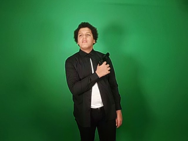
The problem with this image is that the model is looking above the camera and isn't pulling a serious face.


This image has bad lighting, causing the shadow on the right of the shot which is highly noticeable, also the shot is a medium shot, rather than a preferred close up.


This image is a medium shot and has a shadow at either side of the shot, however the stance the model is in is showing aggression through body language.